Razor Sharp Imagery for Retina Displays
The breathtaking Retina display found on Apple’s iPad provides web designers a new opportunity to engage and inspire their audience. Standard resolution images look nice on the Retina display, but the screen doesn’t begin to ooze crispness until it’s fed high resolution imagery. Are your websites taking full advantage of the Retina display?
Is This Really Necessary?
The easiest way to describe the need for high resolution imagery is to compare the first generation iPad to the most recent model. Both models feature a 9.7 inch screen, but the original iPad used a resolution of 1,024 by 768 pixels, while the latest model boasts a resolution of 2,048 by 1,536 pixels. If both models check in at 9.7 physical inches where do all the extra pixels go?
More Pixels Doesn’t Mean More Content
The iPad with Retina display may have double the pixel dimensions as the original model, but this doesn’t mean it can fit twice the amount of content on its screen. In fact, it cannot display even a single character more than the original iPad. So how do all the extra pixels come into play?
Hardware Pixels, Reference Pixels, and Pixel Density
The iPad with Retina display features 1,536 horizontal hardware pixels when held in portrait orientation. This means that if you held a magnifying glass to the screen and physically counted each horizontal pixel in a single row you would tally a whopping 1,536. However, as far as iOS Safari is concerned, the iPad still only has 768 horizontal reference pixels.
This means that if we set our website’s heading text to use a font-size of “3em” the text would take up the same number of real life inches on the 9.7 inch display, and also the same number of reference pixels on both models of the iPad, even though the heading on the iPad with Retina display would be composed of double the number of horizontal hardware pixels.
Apple designed the Retina display to work in this fashion so text sized to be readable on standard pixel density devices would also be reasonable on high pixel density devices (instead of being only half the size and thus impossible to read). The higher pixel density doesn’t change the size of anything; it changes the crispness of everything.
Website Assets – Vector / Raster
This works perfectly for columns, text, borders, shadows and gradients as these elements can scale infinitely without losing a bit of quality. Images, however, are a different story entirely.
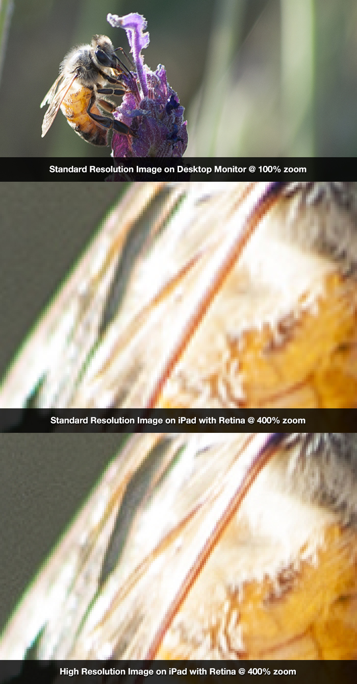
For example, if we save an image file as 768 pixels wide and display it on a webpage it will take up the entire width of the iPad (in portrait orientation) whether it features a Retina display or not.
On the original iPad the photograph is wide enough to offer one pixel of image data for each hardware pixel of the device. However, on the iPad with Retina display, the photo can only offer one pixel of image data for every four hardware pixels of the device. This results in stretching or blurring.
In other words, the image will look great on the original iPad, but only “acceptable” on the iPad with Retina. The engineers at Apple didn’t design the Retina display to look merely acceptable. Follow our recommendations below in order to make sure your website’s imagery is razor sharp on Retina displays.
Two Types of Imagery
There are two primary types of imagery on the web: (1) “img” elements in your page’s content, and (2) CSS background images.
Inline IMG Elements
First, let’s talk about optimizing the images that will be shown in the main column of a website. Imagine we’re designing a responsive web layout with a max-width of 1,200 pixels on desktops and our main column utilizes two thirds of the width. This means the widest our main column will ever be on desktops is approximately 800 pixels. In the past, this meant we could save our images at 800 pixels wide and rest assured that every visitor would see the sharpest possible picture.
Today, however, imagine a user visits our website on an iPad. We’ve used media queries to feed iPads a single column layout, so our main column will be 768 reference pixels wide instead of the 800 pixels from the traditional desktop design. This means on the original iPad we will have 800 horizontal pixels of image data for 768 horizontal hardware pixels of screen real estate. However, on the iPad with Retina we will have 800 horizontal pixels of image data stretching and blurring across 1,536 horizontal hardware pixels. If we want to fully optimize our imagery for the iPad with Retina we will need images which are 1,536 pixels wide.
CSS to the Rescue
An image file that is 1,536px wide will break our layout unless we include a bit of accompanying CSS.
This approach will work flawlessly in every browser and device under the sun. We even included a Microsoft vendor prefix so the images will downscale as smooth as silk even in older versions of Internet Explorer.
If you’re looking to float your images to the side of text instead of having them sit full width on their own line you can use something like this:
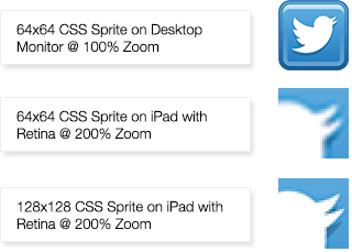
Background Images
Retina display background images are a bit trickier than inline images because the CSS used to downscale and upscale the images accordingly is part of CSS3 and this means older versions of desktop browsers won’t be able to resize background images on the fly. For the widest support possible we recommend you feed desktop browsers and devices with “standard” pixel densities a regular sized copy of the background image, and use media queries to send high pixel density devices a higher resolution copy of the image.
Yes, this means you’ll need to save two versions of the same image. No one ever said looking breathtaking was going to be easy
Here is the CSS we’ll use:
This code will feed traditional browsers and devices the standard sized copy of the image, while high resolution phones and tablets will receive the larger copy of the image and correctly scale it to fit in the same number of reference pixels.
Retina Relatives and the Future
We’ve conquered the Retina display and configured both our content and background images to use high resolution assets. Now that we have razor sharp imagery today, let’s talk briefly about tomorrow.
We’ve been focusing on the iPad in this article, but it’s important to note that the latest model of the MacBook Pro also uses a Retina display (at an even higher 2,880 by 1,800 resolution). This means if someone visited our example website on the newest MacBook Pro with Retina they would be fed the “traditional two column” set of styles and the widest our main column would ever be is 800 reference pixels and 1,600 hardware pixels.
We’re not suggesting you completely forget about bandwidth concerns and begin saving all images for all websites at 1,600 pixels width for the sake of the MacBook Pro. We certainly don’t recommend saving images at 3,000 pixels wide in the hopes of “future proofing” your website once and for all, but this line of thought does raise an interesting set of questions and concerns. No one knows exactly how quickly resolutions will rise in the future, or how widely they will be adopted over the next 1, 3, 5, 10, or 20 years. It’s up to every developer to consider image crispness, bandwidth, and device support on a project-by-project basis.
Go forth and create crispness,
Cheers!